Lydia Zvyagintseva is the former Digital Exhibits Librarian at the Edmonton Public Library.

Data can tell us a lot, about the world and about ourselves.
While there are lots of different types of data out there, one of the most accessible (and interesting) kinds is open data.
What is open data? According to the Government of Canada, opens a new window, it’s “structured data that is machine-readable, freely shared, used and built on without restrictions.” Open data is available from lots of institutions around the globe. The Government of Canada, opens a new window, the Alberta Government, opens a new window and the City of Edmonton, opens a new window—including the Edmonton Public Library, opens a new window—offer open data.
Typically this data is available in a raw, unfiltered form which can be difficult to understand on its own. That’s where data visualization comes in. Creating visual representations of datasets can give them the context they need to have meaning.
Local data visualization company, Darkhorse Analytics, opens a new window, has created some fascinating visualizations using open data. Their work, which you can browse in their online portfolio, opens a new window, is a great example of what’s possible with open data. We took a look at some of their visualizations, focusing on what makes them so interesting and effective, to come up with this list of data visualization tips to help you get started.
|
Are you interested in learning more about open data and how to use it? Every year, EPL runs an This year’s event—which includes talks from local experts (such as Darkhorse Analytics employees) as well as beginner and intermediate data workshops—takes place on Saturday, March 3 at our Enterprise Square Branch. Space is limited, so register now, opens a new window to ensure your spot. |
1. Less is More
Visualization is communication—communication that can take something complicated like data and make it meaningful. When you visualize data, it has the power to tell stories.
The key is: your visualization should only include that information which is needed to help the viewer make sense of the data. Often, this means less is more. Skip distracting fonts and use bold and italic sparingly. Let the design do the talking by communicating vital information to the viewer.
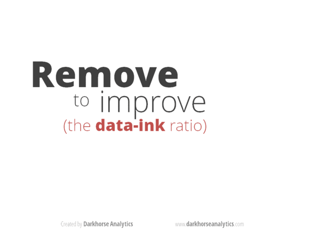
In the same way that you edit out extra words when you write, it’s important to remove elements that do not support the overall goal of your visualization, such as:
• drop shadows
• extra illustrations
• additional notations
• decorations
Keep in mind though: this does not mean you need to oversimplify the story itself. After all, some concepts are complex or use large, multi-variable datasets. However, there is no need to make such concepts even more difficult for the viewer to interpret by including unnecessary text and graphical elements.
For example, visualizing municipal property assessment data is no simple task, with thousands of individual properties represented on the map. Nevertheless, Darkhorse Analytics’s Visualizing Every Assessment, opens a new window graphic (which uses open data from the City of Edmonton) allows you to grasp the overall picture quickly by zooming out. Similarly, the viewer can compare and contrast properties in the same neighbourhood by zooming in and clicking on each property outline to get additional information.
2. Use Colour Intentionally
Colour is an important element of data visualization and can communicate a lot of information to the viewer. Bright colours will highlight certain elements and draw attention to categories of information, especially in contrast to darker colours on the same chart. Colour is most effective if you use the same one to represent the same type of data. Keep in mind that more than five colours in a single visualization can get confusing and will distract from the main points you are trying to make.
For example, Darkhorse Analytics’ Breathing City visualization changes dynamically to reflect the ebb and flow of Manhattan’s population over the course of the day. It uses two contrasting colours to clearly show where the island’s population can be found at every hour: orange for work and blue for home.
The many steps involved in creating the Breathing City #animation of #Manhattan's flow of people at work & at home: https://t.co/Gq8zwit2EM. pic.twitter.com/5GZMykGb7o
— Darkhorse Visualization (@darkhorseviz) July 11, 2017
This strategic use of colour helps the viewer decipher within seconds that at 10 p.m., most of Mahnattan’s residents are at home, while some dedicated night-owls are working in mid-town late into the evening.
3. Tell a Story
Attention spans are short— online and off—so focus on attracting the reader’s attention within the first five seconds.
For example, Darkhorse Analytics’ Baby Names visualization, opens a new window keeps things simple yet impactful. The first screen provides the total number of babies born in Alberta, shows a timeline (from 1980 to 2013) and displays a bold trend line (which increases sharply toward the end of the time scale to demonstrate how one particular name has grown in popularity in recent years.)
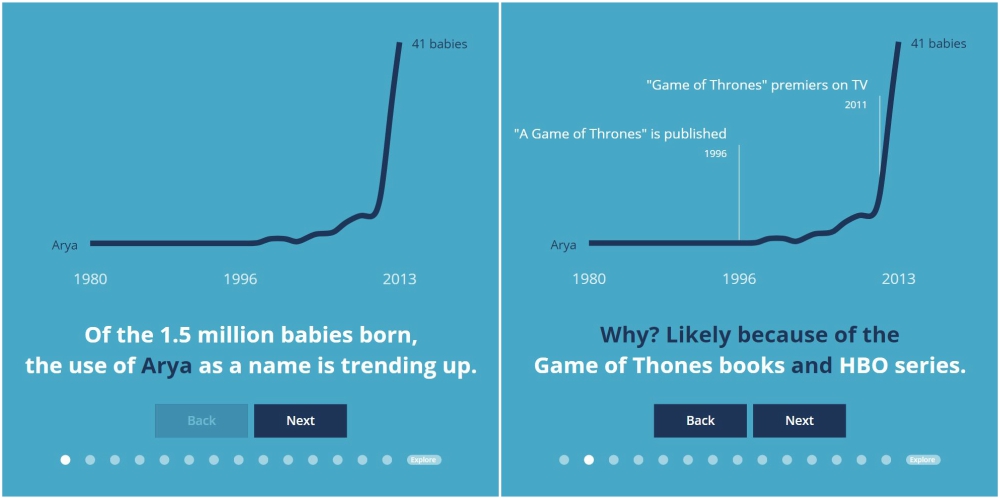
Only two colours are used in this visualization, and they are contrasted against each other to grab the viewer’s attention quickly. Even without reading the text below the chart, we can surmise that something has gone up over time.
We are also invited to pay attention to the name, Arya, as it is highlighted in a different colour. This prompts us to ask why this name has increased in popularity, a question which Darkhorse addresses when we click the “Next” button.
By overlaying the data in the following screens, Darkhorse keeps the data simple while telling a compelling story using data.
Feeling ready to make your own open data creation?
EPL also has plenty of resources to help get you started.

Add a comment to: 3 Tips for Creating Data Visualizations That People Understand